The MyVideoSpot Customer Support team has put together our top tips and tricks to make a MediaSpot project shine! Please reach out to Support if you need additional help.
Spacing
One of the key things to keep in mind while creating a MediaSpot project is spacing. One way to create space between two elements is to drag down a text box, click the green action button to edit the text box, and enter down a few times. Save those adjustments. Now, click the Preview button at the top of the screen to see if you like the spacing. Adjust accordingly.
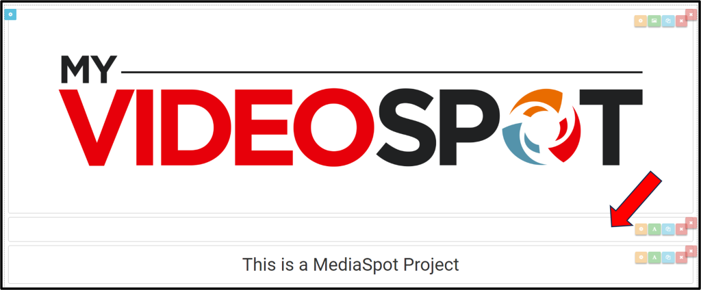
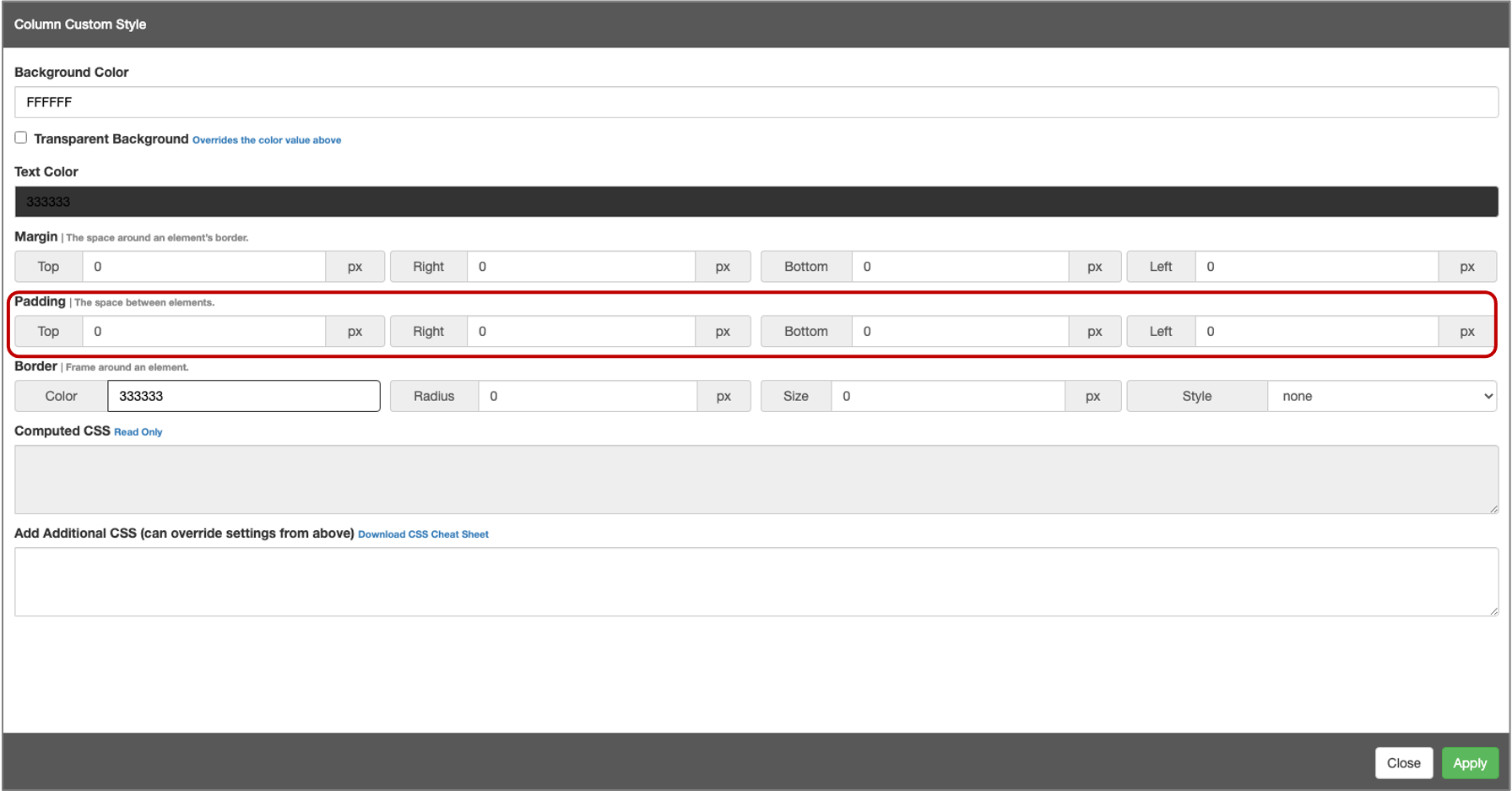
Another way to add space between elements is to adjust the padding. Click on the yellow gear icon and change the padding values. Next, click Apply and then Preview your project. Make further adjustments if needed.
Columns
Columns are also an important component of well organized projects. A trick that we’ve learned is to use separate columns for each additional element. For example, if you have 2 columns, a text box in the left and a video on the right, and you are trying to put another text box and video below that, drag down a separate 2 column section first. Do not put them in the same 2 column section. That way, everything will be aligned correctly.
Headers
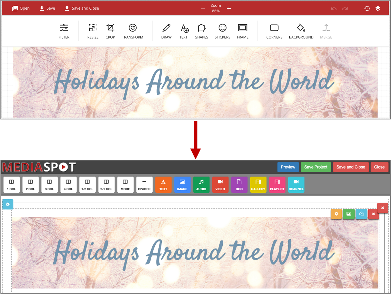
A quick and easy way to make your MediaSpot project pop is to add a fun header image. These can easily be created many different ways by layering text and images/clipart over a background. We even have a built in Image Creator where you can create a header that saves in your MyVideoSpot account.
Fonts
Fonts are a fun way to spruce up any project but be careful to keep your fonts consistent! You do not want too many conflicting fonts nor do you want to use any that are difficult to read. You probably do not want more than 2 separate fonts in a single project; 1 font for headers and titles and 1 for body text.
CSS
You may have noticed the yellow cog wheel icon while working on a MediaSpot project—that’s for CSS! CSS, or Cascading Style Sheets, is a type of coding language that is primarily used for changing the layout and look of websites. It’s not necessary to utilize CSS when creating your MediaSpot project, but if you’d like to fine-tune some elements or just play around with the effects, this guide and this cheatsheet will show you some basics. On the guide, you’ll see the relevant code for the effect and also see it in action while the cheatsheet is for quick reference.
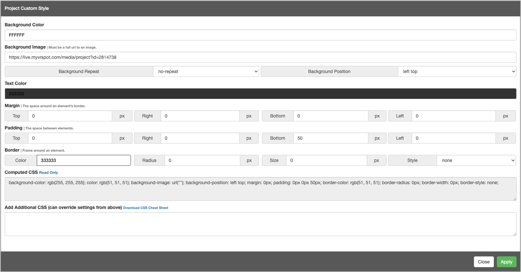
To add a background color or image behind the entire project, click the blue gear icon in the top left corner. Click inside the background color box and select the color you like or enter the hex code for a specific hue. To add a background image, simply paste an image’s URL in the designated field. Click on the hyperlink above the Add Additional CSS box for a CSS Cheat Sheet.
